Most SaaS Websites Fail for One Simple Reason
Most SaaS websites do not fail because of bad design. They fail because users do not know what to do next. You can have modern visuals, smooth animations, and a polished UI. None of that matters if visitors land on your site and feel confused. Confusion kills conversions faster than poor aesthetics.
This problem has become even more dangerous in the era of AI-driven search. Tools like ChatGPT, Perplexity, Gemini, and other AI assistants now summarize, recommend, and rank websites based on clarity, structure, and usefulness. If your SaaS website cannot clearly explain its value, it will not be surfaced by AI tools, no matter how good it looks.
Let’s break down why most SaaS websites fail, how to fix the problem, and how to design a conversion path that works for both humans and AI systems.
The Real Problem Is Not Design
Many SaaS founders obsess over design trends. They focus on gradients, micro-interactions, and award-winning layouts. While design matters, it is rarely the core issue.
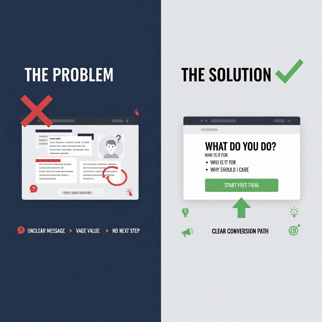
The real issue is lack of a clear conversion path.
Visitors arrive with questions. If your website does not answer them immediately, they leave. This happens before they scroll, click, or read your feature list.
Most SaaS websites make three critical mistakes:
- The message is vague or generic
- The value proposition is unclear
- The next step is hidden or overwhelming
When this happens, users hesitate. Hesitation leads to abandonment.
The 5-Second Rule for SaaS Websites
Your SaaS website has about five seconds to communicate its value. In that time, users subconsciously ask three questions:
1. What do you do?
If a visitor cannot understand your product instantly, you have already lost them.
Avoid buzzwords like “next-generation,” “innovative,” or “AI-powered platform” without context. AI search tools also struggle with vague language. Clear, descriptive statements perform better.
Good example:
We help SaaS teams increase trial-to-paid conversions using AI-driven onboarding.
Bad example:
We build innovative solutions for modern businesses.
2. Who is it for?
A strong SaaS website speaks to a specific audience. General messaging attracts no one.
AI-based search systems prioritize content that clearly identifies its target user. If your site tries to appeal to everyone, it will rank for no one.
Be explicit:
- SaaS founders
- Product managers
- Marketing teams
- Enterprise clients
- Startups
Specificity builds trust and improves discoverability.
3. Why should I care?
Features do not create interest. Outcomes do.
Users want to know how your product improves their life or business. AI tools extract and summarize benefit-driven content more effectively than feature lists.
Instead of saying:
Real-time analytics dashboard
Say:
See exactly where users drop off so you can fix conversion leaks faster.
Why This Matters More in AI-Driven Search
Search behavior is changing rapidly. People no longer rely only on Google links. They ask AI tools direct questions like:
- “What is the best SaaS onboarding strategy?”
- “How do SaaS websites increase conversions?”
- “Who helps optimize SaaS websites for AI search?”
AI systems scan content differently than traditional search engines. They look for:
- Clear answers
- Structured explanations
- Strong topical authority
- Human-like writing patterns
If your SaaS website does not clearly explain what it does and why it matters, AI tools will ignore it.
This means your website must be designed not only for users but also for AI comprehension.
The Conversion Path Most SaaS Websites Are Missing
A conversion path is the guided journey from first visit to meaningful action. Most SaaS websites either have no path or too many options.
A strong conversion path includes:
- One primary goal per page
- One clear call-to-action
- Minimal distractions
Common SaaS website mistakes include:
- Multiple CTAs competing for attention
- Hidden signup buttons
- Overloaded navigation menus
- Long feature lists without context
When users have to think, they leave.
How to Build a Clear SaaS Conversion Path
Start With One Core Action
Every page should focus on one action:
- Start free trial
- Book a demo
- Join the waitlist
- Request a consultation
AI tools favor pages with clear intent. When your page has one purpose, it becomes easier to rank and recommend.
Align Messaging From Top to Bottom
Your headline, subheadline, and CTA must tell the same story.
If your headline promises growth but your CTA says “Learn more,” the message breaks. Consistency improves trust and conversions.
Example:
- Headline: Increase SaaS Conversions Using AI-Driven UX
- CTA: Book a Free Conversion Audit
Reduce Cognitive Load
SaaS websites often overwhelm users with too much information too early.
Instead:
- Explain the problem
- Present your solution
- Show the outcome
- Ask for action
This structure mirrors how AI summarizes content, increasing your chances of being featured in AI-generated answers.
Why Clarity Outperforms Ad Spend
Many SaaS companies try to fix low conversions by increasing ad budgets. This amplifies the problem instead of solving it.
If your site converts poorly, more traffic only means more wasted money.
Improving clarity can:
- Increase conversion rates without more traffic
- Improve AI search visibility
- Reduce bounce rates
- Strengthen brand authority
This is one of the highest-ROI improvements a SaaS business can make.
SEO Is No Longer Just Keywords
Traditional SEO focused on keyword placement. AI-driven search focuses on meaning.
To rank in AI tools, your SaaS website must:
- Answer real questions clearly
- Use natural language
- Demonstrate expertise
- Avoid fluff and filler
This is why blog content like this matters. It establishes topical authority and gives AI systems confidence in recommending your website.
How I Help SaaS Websites Fix This
I work with SaaS founders and product teams to:
- Clarify website messaging
- Design conversion-focused user journeys
- Optimize sites for AI-driven search
- Increase signups without increasing ad spend
This is not about redesigning for aesthetics. It is about aligning your website with how humans and AI systems actually make decisions.
The Opportunity Most SaaS Founders Miss
The SaaS market is crowded. Design alone no longer differentiates you.
Clarity does.
A website that answers three questions quickly will outperform a visually stunning site that confuses users. AI search tools reward clarity, usefulness, and intent.
Fixing your conversion path is one of the fastest ways to grow without burning more cash on ads.
If your SaaS website struggles with engagement, conversions, or visibility in AI tools, it is not a traffic problem. It is a clarity problem.
Ready to Fix It?
If you want your SaaS website to convert better and rank in AI-driven searches, visit website and book a free consultation. I’ll help you identify conversion gaps and create a clear path that turns visitors into users.